

.jpg)
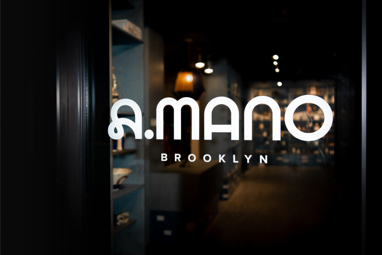
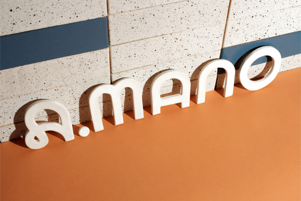
Sergio Mannino is an Italian architect and designer who has mastered the intricacies of the retail and merchandising industry. A true visionary, he deeply understands each brand's story and seamlessly integrates it with contemporary innovations. His ability to convey these narratives visually and spatially, while infusing his Italian roots into his designs, is remarkable. We spoke with Sergio Mannino, who has garnered great success in New York with his shops and concept stores, about his latest project, A.Mano Brooklyn—an elegant fusion of Italian postmodernism and American minimalism—and his insights on the retail industry.
INTERVIEW BY AKGÜN AKDİL
Can you talk us through the design process for the A.Mano Brooklyn Store?
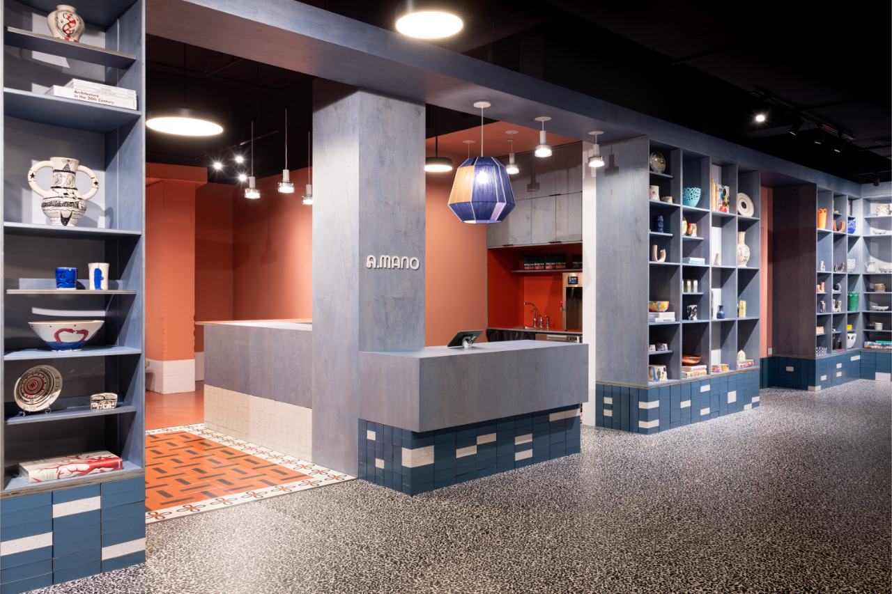
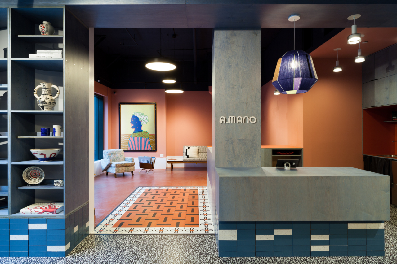
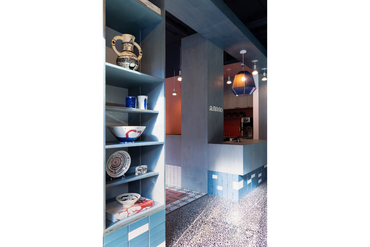
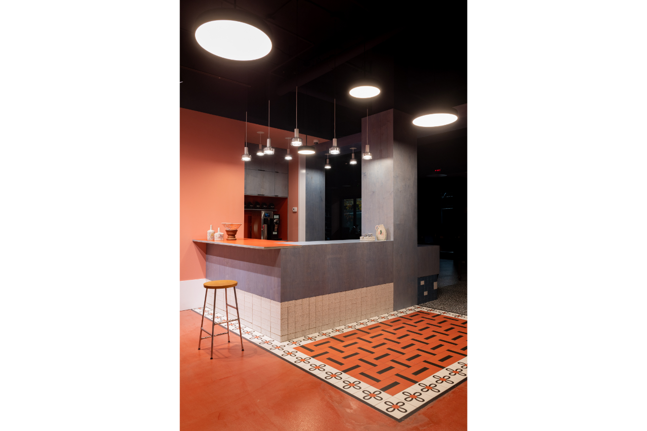
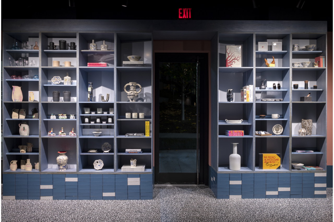
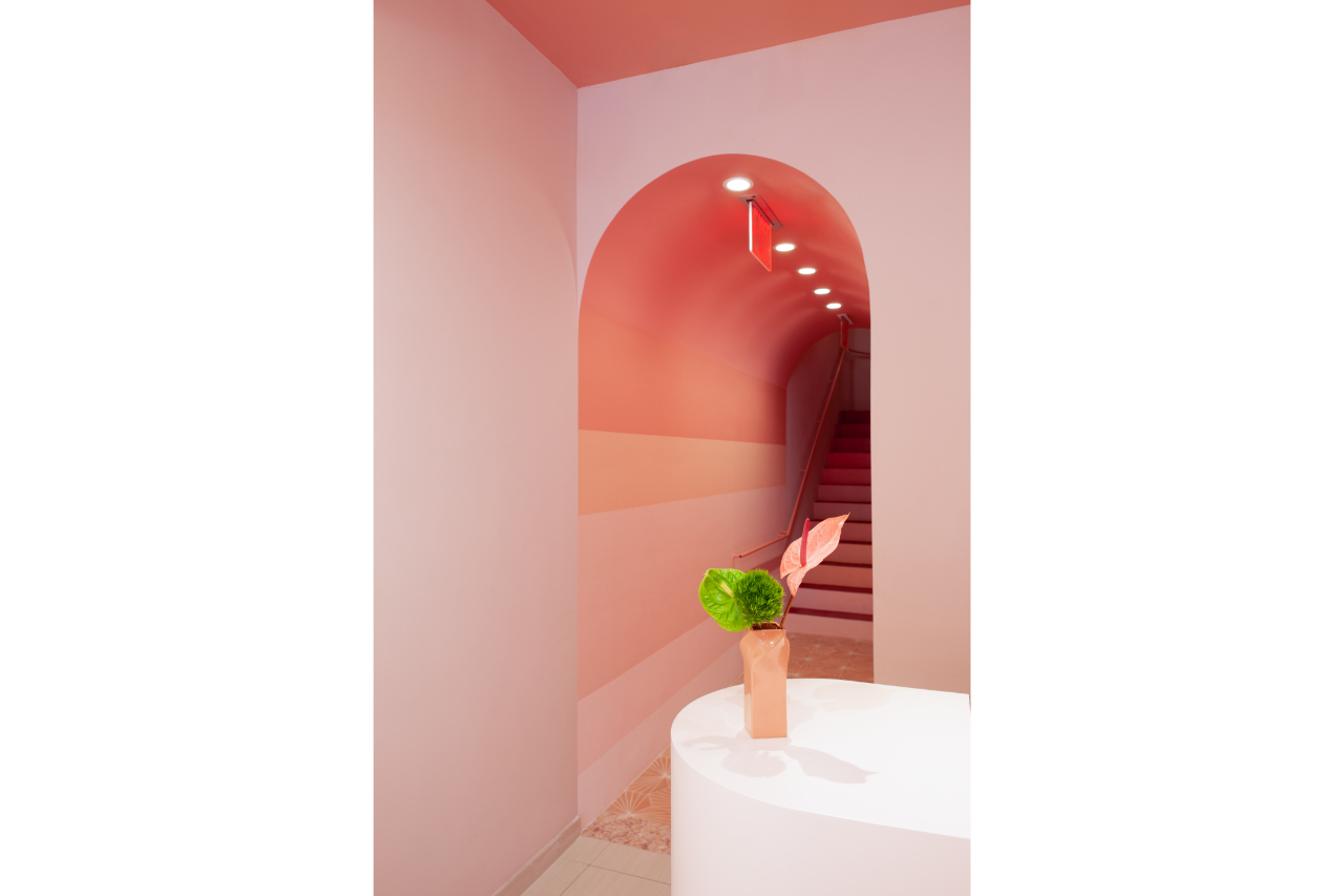
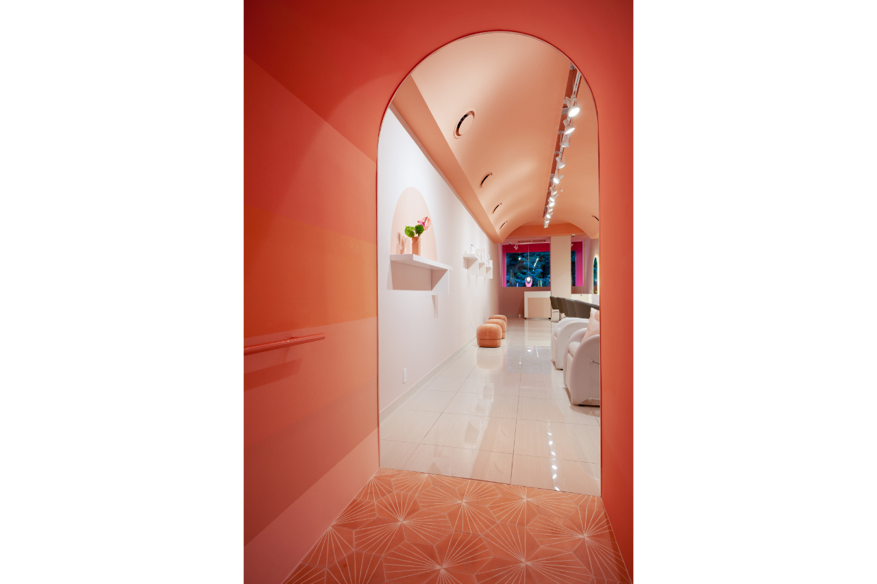
The store was born from an idea of Katherine Wells, the client, who is a ceramicist and was working at BRKLN CLAY, a ceramic workshop and studio right next to the store. There, she saw many talented artists working hard on beautiful pieces but needed a place to sell their art. As a result, she rented a vacant space beside the studio and called me for the design. We spent a considerable amount of time defining what A.Mano Brooklyn stands for: its values, goals, mission, and more. The store's design and identity represent these values; each material, color, and shape represents or refers to a specific message we want to convey. We worked on the interiors and branding simultaneously, making sure every touch point of the brand would convey the same messages and appear consistent.
You had combined Italian postmodern and American minimalism in A.Mano Brooklyn. How was your strategy for this blend?
A.Mano Brooklyn is a new brand, and, as we said, we worked closely with the client to develop her vision. Among all the different inputs we received from her, we realized that she was trying to combine a "funky spirit" with something more structured and rational. For instance, one of the references she gave us was the movies "Knives Out," and "The Royal Tenenbaums" by Wes Anderson, but she also pointed to Carhart, Dior, and a specific BMW. Functionality also came up a lot during our meetings. We were led to a highly imaginative design yet constrained by a strictly rational environment.
To interpret this, I thought we had to combine two opposites, a process I always find fascinating, like mixing two ingredients that are not supposed to belong to the same dish. This is how the idea of referencing Donald Judd on one side and Memphis on the other came up. These choices are obviously strictly connected with my past, passions, and inspirations.
What were your rules for sustainability in A.Mano Brooklyn?
Stores produce enormous amounts of waste because their lifespan is so limited. If a store lasts ten years, you are lucky. Most places close or change after only a couple of years. Instead of thinking about sustainable materials that would be wasted anyway, I felt we could try to design a store as a Lego project. All elements (or almost all) would be assembled without using any glue, only with screws and mechanical connections, hoping that most of the material would be used elsewhere at the end of the store's lifespan. And that's what we were able to do, even the ceramic bricks at the base of all the displays are connected mechanically without using mortar. At the end of the store's life, they can easily be disassembled and used on another project. We recently realized this strategy is powerful because we just redesigned a portion of the store to turn it into a coffee shop. All elements were disassembled, and most were reused in the new design, limiting the amount of new material and the waste to a bare minimum.
What about the relationship between the store A.Mano Brooklyn, the makers and the designers? Is the store the focal point of this relationship? Is it a successful business model?
The store acts as a showcase for the makers' craftsmanship, but it also sells a very well-curated series of books on art and design. This symbiotic relationship is key to the store's success, as it builds a unique identity and attracts customers who appreciate creativity.
How would you describe your approach to retail design?
Storytelling: my approach centers on creating immersive experiences that reflect the brand's story. Every material or color we choose is there for a specific reason. Colors and materials carry meanings that are in part embedded in our DNA and in part cultural, meaning different in each population or group of people. We all react to sky blue or green similarly because of our ancestors: a green forest was a safe place with shelter and food, and blue is the color of tranquility and serenity, with no thunderstorms from which to seek shelter. The challenge is combining them to create the stories that best represent the brand.
What do you think are the indispensable elements of successful retail design?
A clear message is essential. Without it, you are not communicating with your customers and cannot connect with them.
As far as I observe you like the vibrant colors and gradient. You also have an IG account called @notbeigeplease. What would you like to say about this?
The world around us is not in shades of white, gray, or beige. Colors are everywhere. Unfortunately, for some reason, at the birth of modernism, they were removed from the ingredients of architecture and design. Ironically, it could also be that publications were in black and white, and colors were not displayed. Le Corbusier used a lot of colors, but many others did not. It is also possible, and here I am entering uncharted territory, that European colonization may have played a role in the suppression of vibrant colors in design and crafts, with colored artifacts from colonized regions potentially being associated with inferiority and consequently rejected by the elite. Anyway, I come from the south of Italy, from the Mediterranean Sea. Colors are everywhere, and the sun makes everything vibrant and alive. I use colors to tell stories. They are so powerful that you almost don't need anything else. Why limit yourself to white and beige? @notbeigeplease was born from these ideas, but it also wants to celebrate designers and architects who are taking a risk. In the 1980s, real estate brokers in the US often advised their clients to paint their apartments beige. The idea was that beige is a neutral color that appeals to a wide range of potential buyers. I believe now it's been replaced by white. Beige is the safe choice, not just as a color. Beige represents conformism; color is for the ones willing to take a risk.
Which colors and forms do you believe are most impactful in store design?
I cannot answer this. Every color and shape can be impactful. There is not a specific recipe. It depends on the message.
In your opinion, what does effective visual merchandising that captures customer attention look like?
As we discussed before, effective visual merchandising captures customer attention by telling a story. It uses focal points, thematic displays, and strategic lighting to highlight products and guide customers through the store. It should be dynamic and regularly updated to keep the experience fresh.
What does the new generation of consumers expect from brick-and-mortar stores?
They see the store as an extension of the brand's online presence. It was likely the opposite for the older generation, or the two were considered distinctively. Young people demand a smooth and efficient customer experience (not to be confused with Instagrammable spaces or special effects), meaning they want to go from IG to the brand's website, their Twitter feed, or to a physical purchase in the most efficient way. I will give you a small example: if you go to Starbucks in the US and order your coffee, they ask for your name so that they can write it on the cup; often, you need to spell it because people living here are from all over the world; then you finally pay with a credit card or with your phone and wait for the coffee to be ready. Why can't they reverse the process? If I pay with my credit card, my name is already there; you don't have to ask me to spell it. A sticker can come out of the register in a second. These are the things that younger people find frustrating, and we can spend hours describing them all.
What are the current trends in the retail industry and visual merchandising? How do you assess these trends?
Karl Lagerfeld once said, "Trendy is the last stage before tacky." I don't think we should look at trends. By the time you implement one, it's already outdated. I've lost count of the number of times I've been asked to incorporate traditional chandeliers or flower walls in the stores. Instead, I think it's important to look at where we are at this specific moment in history as a culture and humanity. If we work from that, we can't go wrong.
How do you balance aesthetic appeal with functionality in your retail designs?
I don't really like the word functionality because it creates a distinction between beauty and practicality. Beauty is a function. Probably the most important one. In Western culture, beauty is detached from the world, meaning that beauty is found in art or a beautiful landscape. A painting should be beautiful, but a chair must be comfortable (with a place for your coffee cup). In Japanese and to some extent Italian culture, beauty is found in daily living or in "the art of living." Embracing the idea that life requires beauty in every action, even the most ordinary ones, breaks down the notion that function and beauty are separate. The tea ceremony is beautiful not just because the room is well designed but because each gesture is beautiful. Incorporating beauty into each object, gesture, idea, interior and architecture, is a way of showing love for life itself and for humanity.
Could you share some insights into your branding projects and how they integrate with your retail designs?
We ensure that every touchpoint, from the storefront to the graphics, reflects the brand's identity and values. This holistic approach helps create a seamless and memorable brand experience. You want your customers to go from a website to an IG page or your store, recognize your brand, and know immediately what it is about without having to describe anything. If you can achieve that, the rest will come naturally.
Can you give an example of a retail design project that significantly boosted a brand's customer engagement and sales?
Medly Pharmacy was a retail project that significantly boosted brand recognition. It was widely published and very different from any other pharmacy at the time. Unfortunately, the brand grew too quickly and did not survive the downturn of independent pharmacies during Covid.
You created a stunning rug collection titled "Secret Gardens." Could you share some details about this collection?
When I designed the Secret Gardens collection, I imagined a world hidden behind walls, away from the buzzing life of an urban metropolis. Secret Gardens have a long history in Italian culture, dating back to the Renaissance when they became popular or, in Sicily, to the Arab dominance 500 or 600 years earlier. These gardens are conceived as hidden oases, beautifully designed, often with water fountains and beautiful architectural elements.
For this collection, I imagined gardens that transcend our ordinary reality, like metaphysical worlds where the laws of physics do not apply, and colors are not what you would expect. These sanctuaries are meant to be experienced by letting yourself go, and your mind wander in the realm of the imagination. Just don't limit them to kids' rooms; they have been designed for adults.
In recent years, Italian design and the "Made in Italy" label have captured significant attention in the U.S., celebrated for luxury, quality, and originality.
Read more
In the United States, department stores are downsizing while small retail is seeing a revival.These are independent stores, frequently managed by experts from the design industry, who are on the lookout for high-quality, unique, sustainable Italian items. Paolo Cravedi, brand ambassador of Milano Home, tells us about it.
Read more
Share
You could be interested in
News
Milano Home is preparing to become the prime stage for the meeting of supply and demand in the lifestyle sector. Over 750 carefully selected buyers from the Milano Home Brand Ambas ...
Read more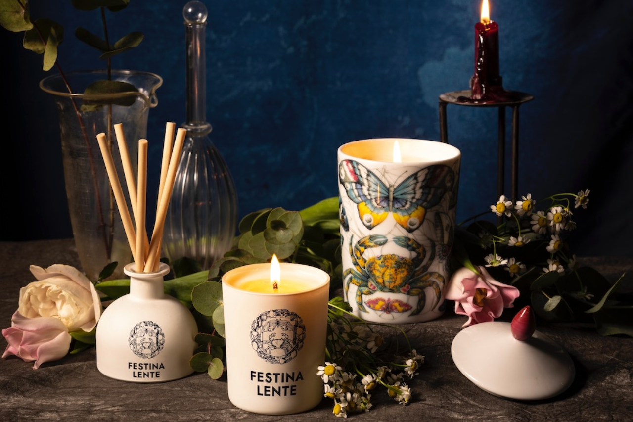
News
Amel Lamtioui, President of DESIGN PHILOSOPHY, shares her passion for Italian craftsmanship and bold innovation. As a 360° global agency based in France, her company champions the ...
Read more
News
Manila – Elegance, creativity, quality, and excellence: Italian design continues to exert an irresistible fascination on Asian consumers, particularly in the Philippines.
Read more

© 2023 MILANO HOME. All rights reserved.


